examples
of my work
I approach every project with the goal of creating work that not only looks great but performs with purpose. Whether developing high-impact performance creative, transforming static visuals into dynamic motion concepts, or crafting cohesive brand identities and print pieces, I focus on delivering efficient designs that convert. The sections below highlight key case studies and just a small selection of my work.


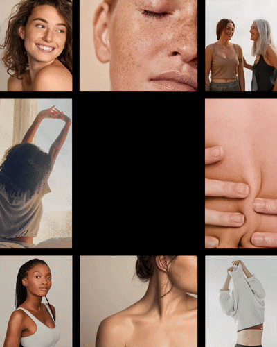
HIGH-PERFORMANCE SOCIAL ADS
Meta Ads Deliver 37%
QUARTER OVER QUARTER
Revenue Boost
Industry: Ecommerce Health & Wellness
Channel(s): Meta
My Role: Art Direction & Graphic Designer
The Goal: Boosted sales consistently by leveraging a mix of creative testing, ad formats, and data-driven optimizations.
Outcome: Campaign refinements and creative testing led to a 37% QoQ revenue increase while maintaining cost efficiency and scaling conversions.


.png)
.png)


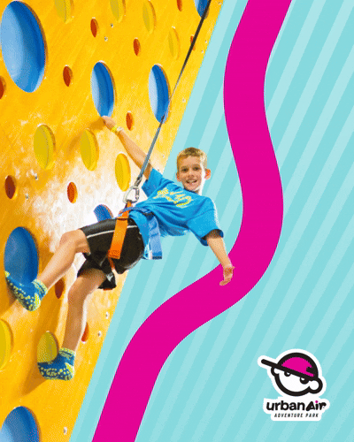
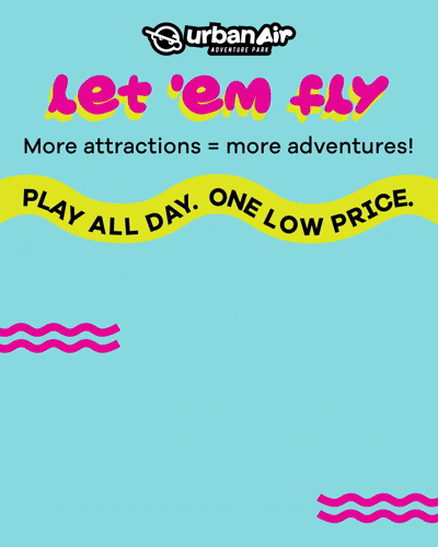
"THE BEST ad CREATIVE WE'VE EVER HAD FROM AN AGENCY OR IN-HOUSE"
- CURRENT URBAN AIR CMO & FORMER BURGER KING CMO
Industry: Multi-Location Retail
Channel(s): Meta & Google Display
My Role: Art Direction & Graphic Designer
The Problem: The CMO felt their current ads were stale. I wanted to breath light into a fun, adventurous company's ads without changing the branding itself.
The Goal: My goal was to refresh the creative approach by leaning more into their vibrant colors and showing kids in action at the park, resulting in more engaging content.

.png)

.png)
.png)
.png)
STATIC TO
MOTION DESIGN
Scrappy, Smart, and Styled:
Art Direction That Sparks motion

Initial Frames to Final Motion concept
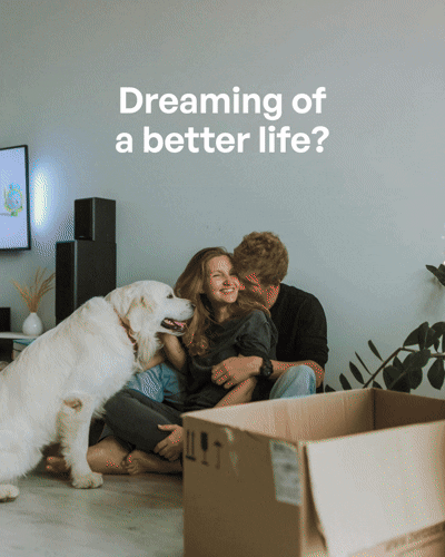
My Role: Art Direction & Graphic Designer
My Process: My process starts with understanding the brand’s visual voice and identifying how to elevate it. From there, I map out each frame to establish the ad story, creating everything from custom illustrations to UI mockups. I collaborate closely with animators, providing clear notes, style references, and open feedback loops to ensure the motion builds naturally on the established vision. I thrive in scrappy environments with minimal assets, finding creative ways to make every frame feel elevated and cohesive.
Outcome: The result is animation-ready design that not only looks great in stills (and is a ready to-go A/B test), but also translates seamlessly into motion, resulting in a
winning ad.

Initial Frames to Final Motion concept


Initial Frames to Final Motion concept

Initial Frames to Final Motion concept

branding
From Strategy to Launch:
A Complete Rebrand Built to Reflect Growth
Industry: Marketing Agency
My Role: Art Direction & Graphic Designer
My Process: We started by polling employees and clients to understand how the brand was perceived, uncovering key themes like growth, boldness, and collaboration. These insights guided the design including: a confident new logo, a bold new color system, and modern, playful typography. We created custom shapes derived from the logo and layered in textures and patterns for flexibility and visual depth. Once the brand was solidified, I led its implementation across sales decks, presentation templates, social posts, and dozens of custom web graphics, ensuring a cohesive look from strategy to launch.
Outcome: The new brand fueled growth and helped win larger clients, while creating a cohesive, confident look across all touchpoints. It received widespread praise for its bold, modern, and playful identity.
BRAND GUIDELINES
.png)
.png)
.png)
.png)
.png)
.png)
.png)
.png)
.png)
.png)
.png)
EXAMPLE SLIDES FROM DECK TEMPLATES
.png)
.png)
.png)
.png)
.png)
.png)
.png)
.png)
.png)
ALL GRAPHICS ON TUFFGROWTH.COM WEBSITE

Designing the Next Chapter of a 100-Year-Old Brand
Industry: Marketing Agency
My Role: Art Direction & Graphic Designer
My Process: The goal was to refresh a century-old agency's brand without losing its legacy. I led the refresh to make it feel more modern, creative, and versatile while staying true to its core identity and looking cohesive with older branding material. I identified 3 main issues: an overused font, a flat monochromatic palette, and a lack of versatile graphics. By reworking these elements, I was able to bring new life to a simple, corporate brand.
Outcome: The result is a brand that feels elevated and forward-thinking, yet still authentically connected to its 100-year legacy, resulting in a company-wide full rebrand to come.
REFRESHED DECK
.png)

.png)
.png)
.png)
.png)
.png)
.png)
.png)